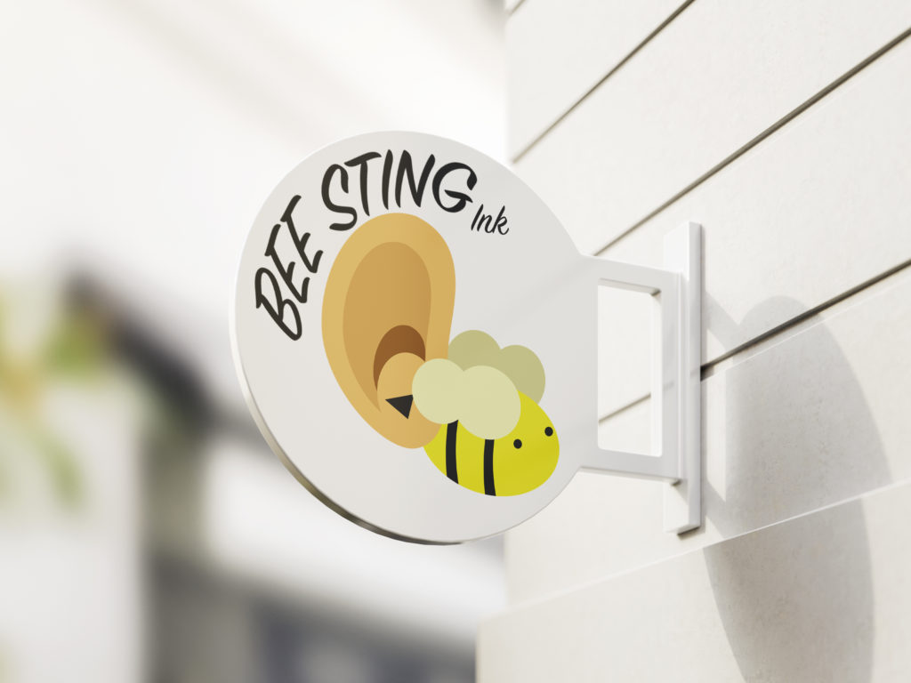
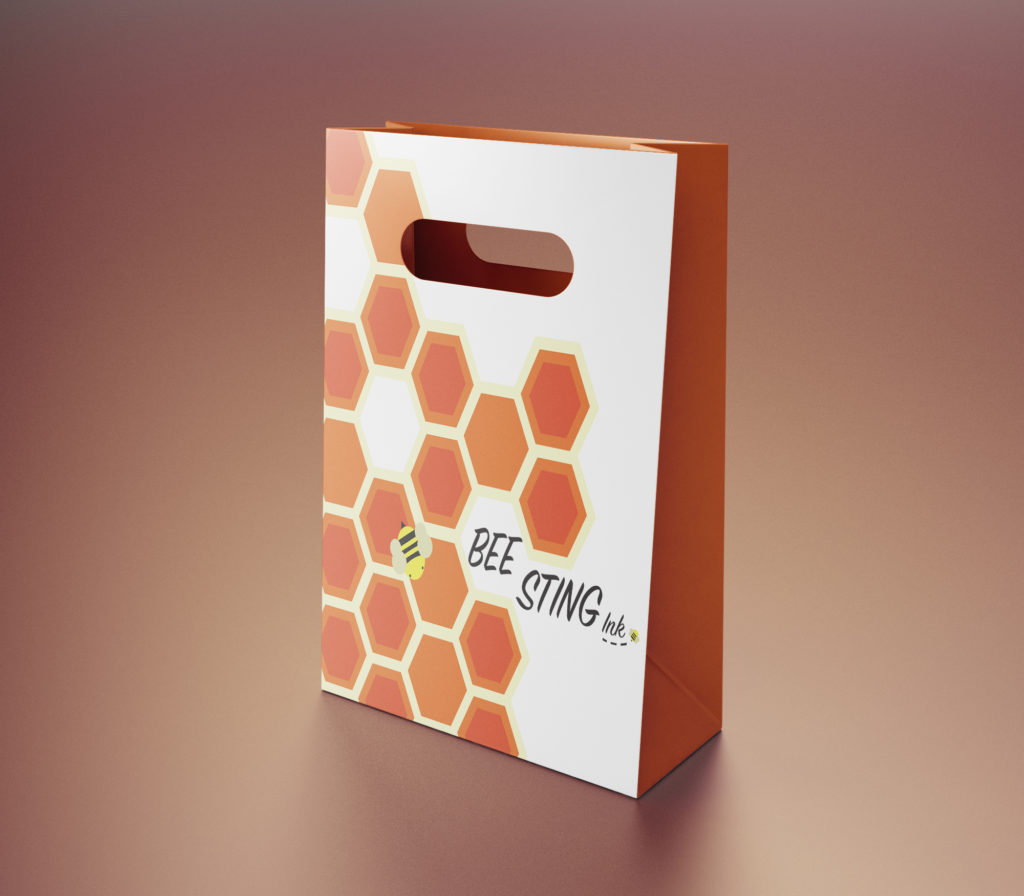
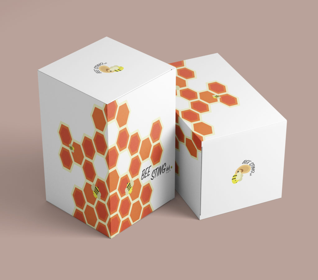
These are the designs and packaging that I made for my mock company. The branding is meant to be for a tattoo and piercing shop- the bag is for holding purchased jewelry and the boxes contain saline solution, or other helpful products.

Katrina Hoff
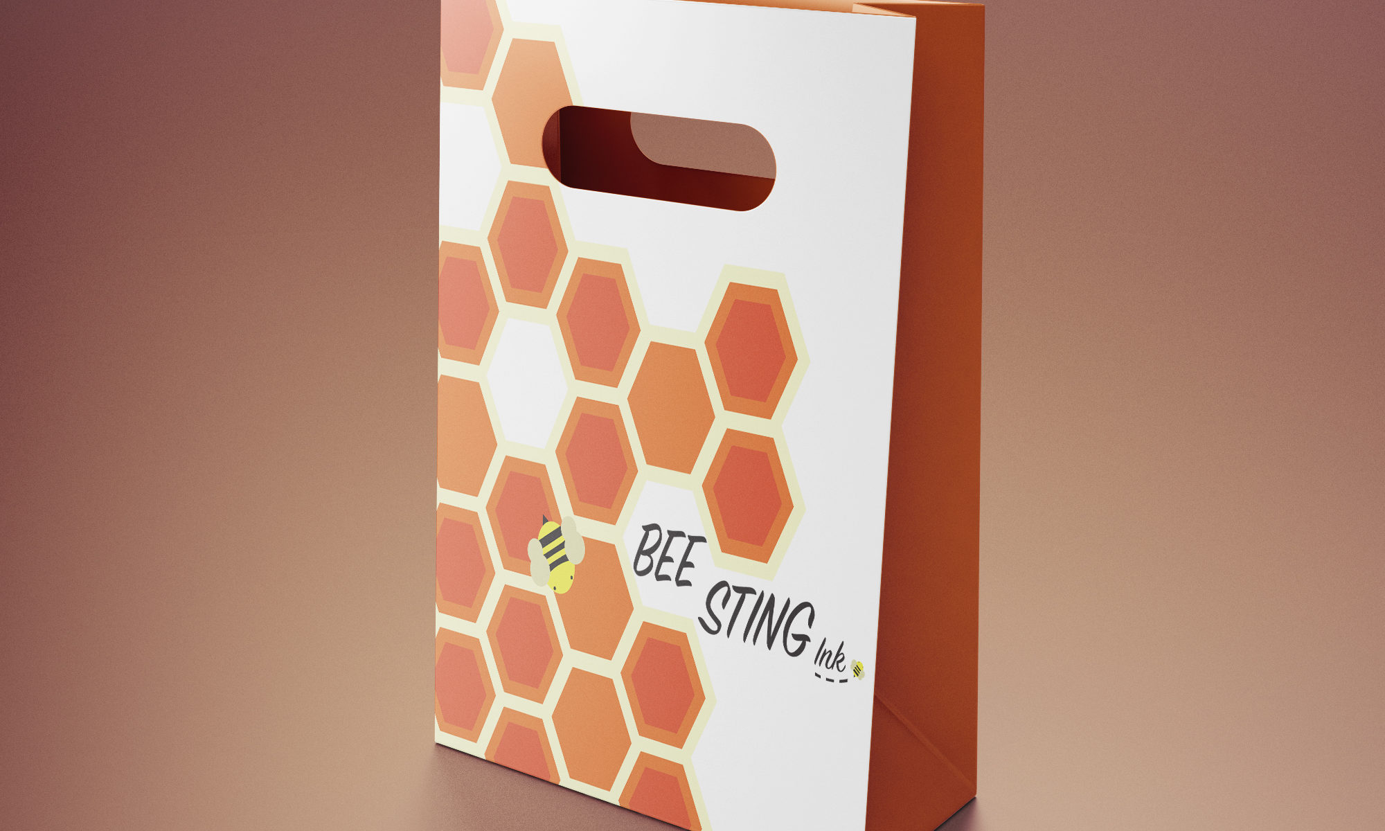
These are the designs and packaging that I made for my mock company. The branding is meant to be for a tattoo and piercing shop- the bag is for holding purchased jewelry and the boxes contain saline solution, or other helpful products.

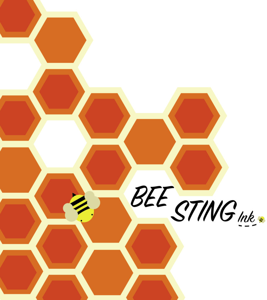
I’ve been working on developing my style of creating graphics, and I feel that these two designs are the best examples of it so far. I enjoy the flat, cut-out look, and like using bright colors.
The first image, was one that I made for my service sorority to use in our display case. The second, is one that I made for a mock company. I also designed packaging and a sign for the company to use, which can be viewed in the next post, or by clicking the link below.